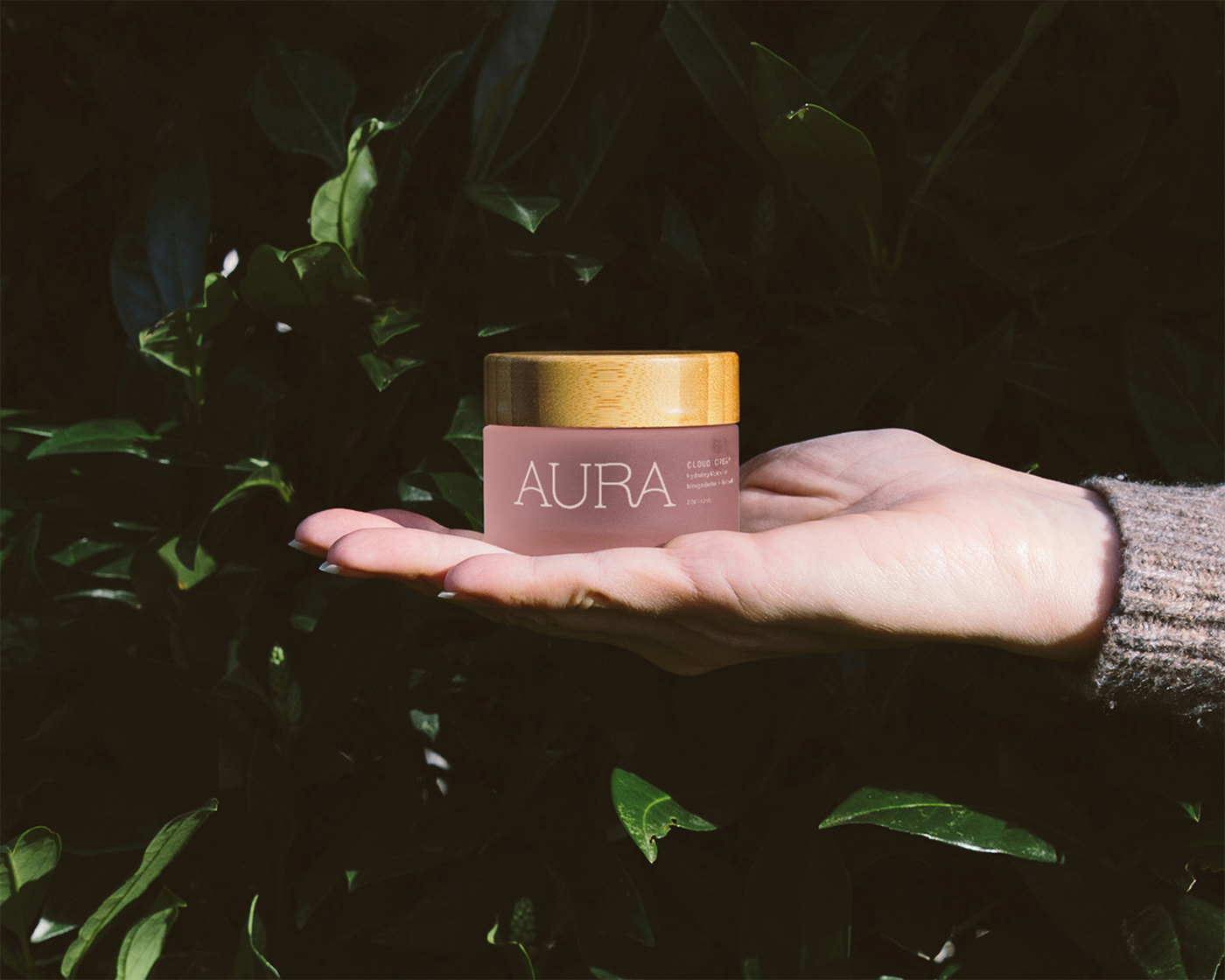
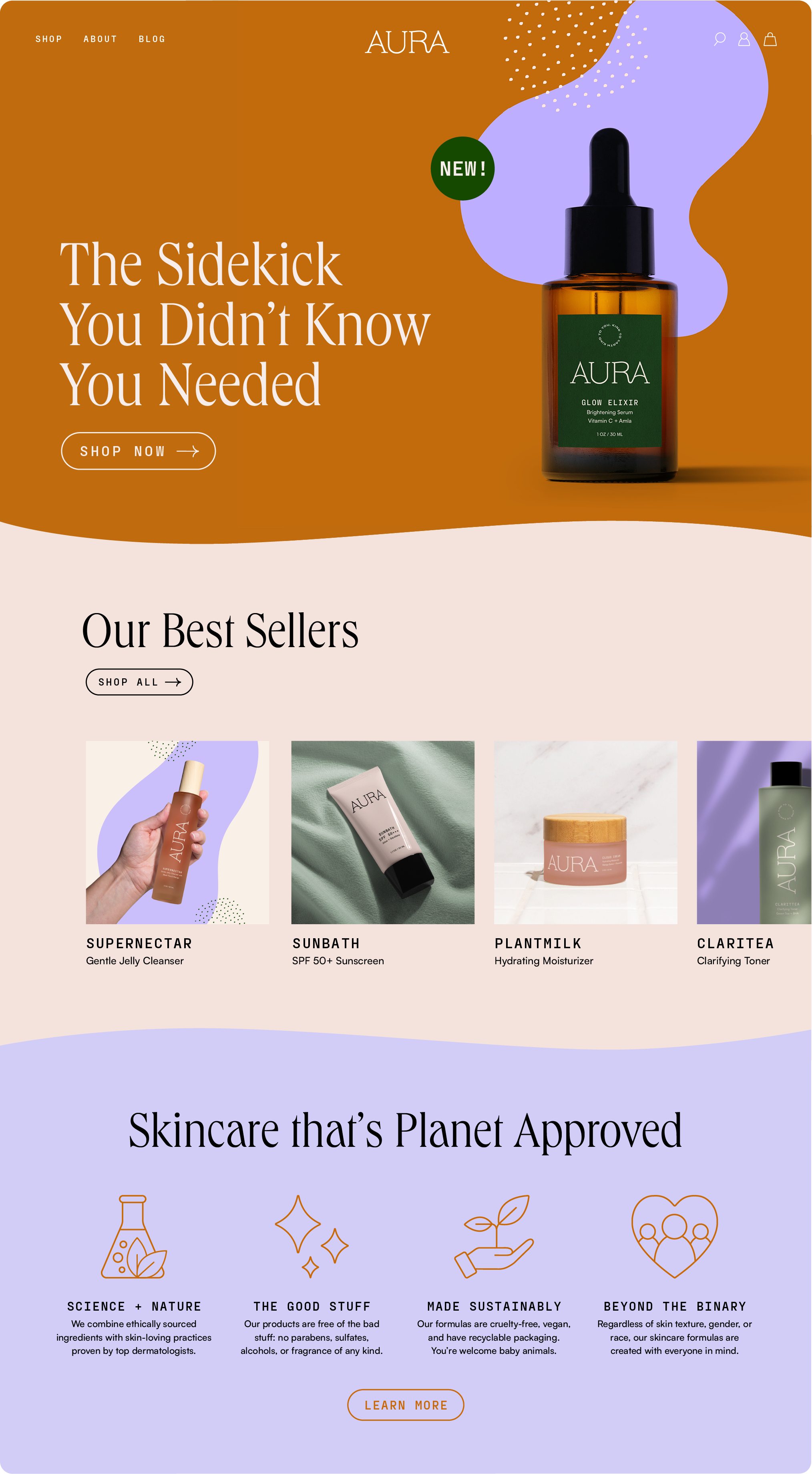
Aura is a skincare brand inspired by the wellness of ourselves and the Earth and challenging the way we look at skincare.


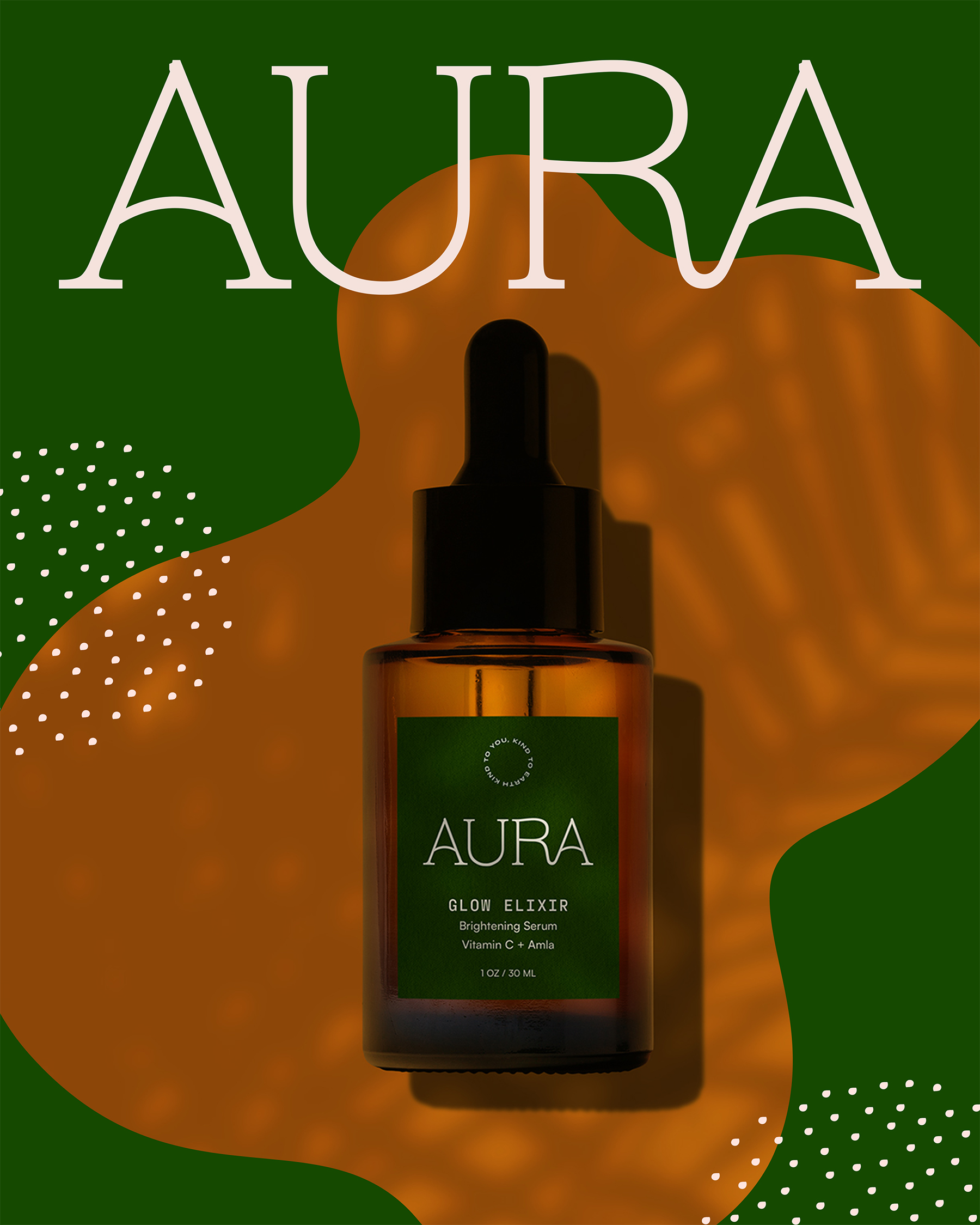
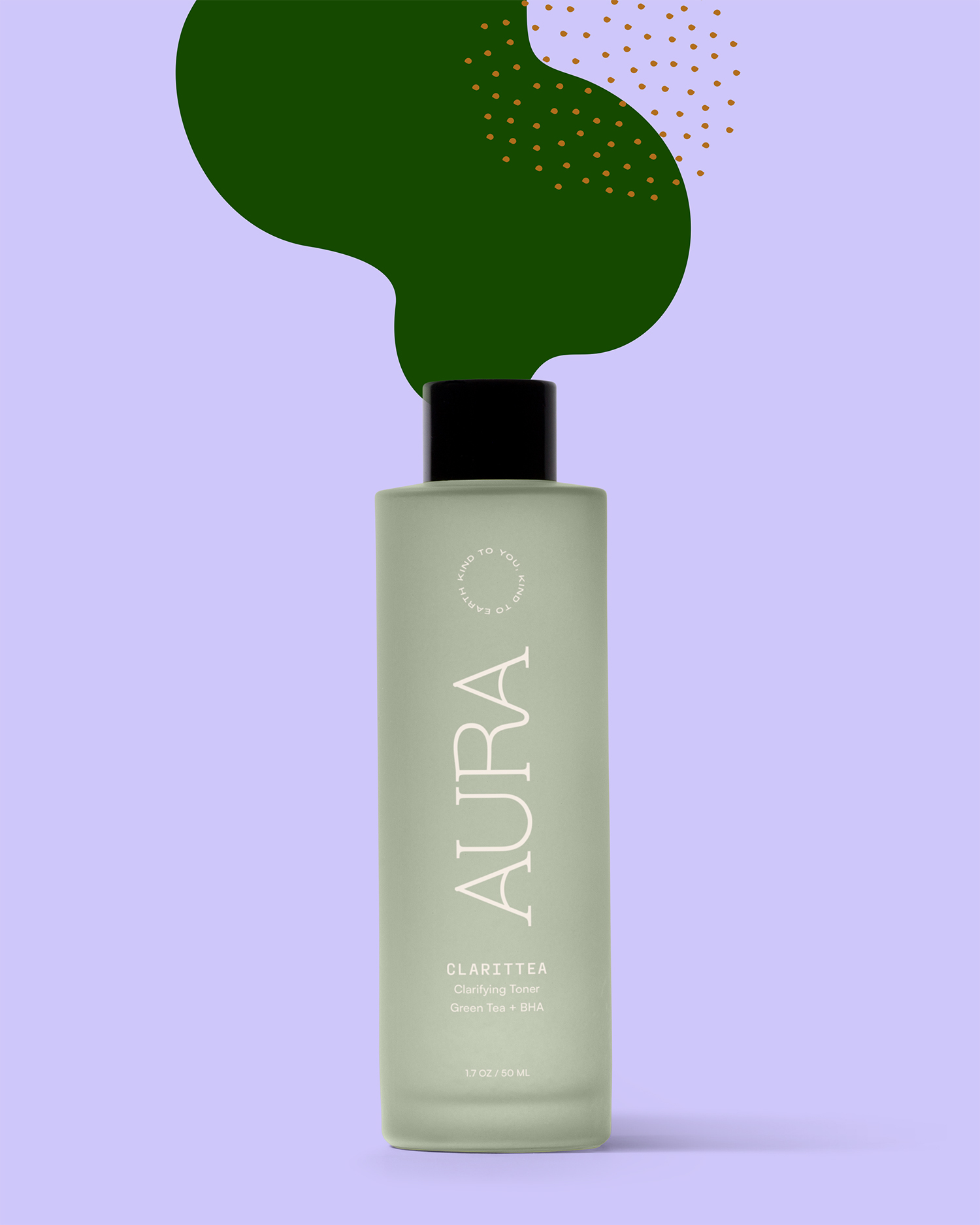
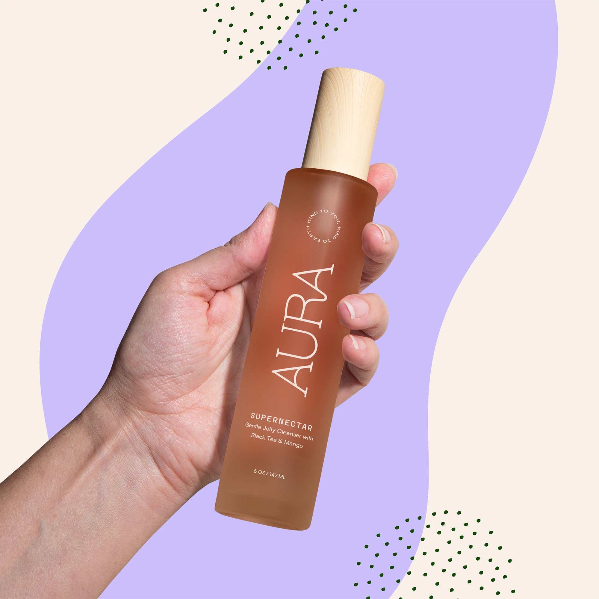
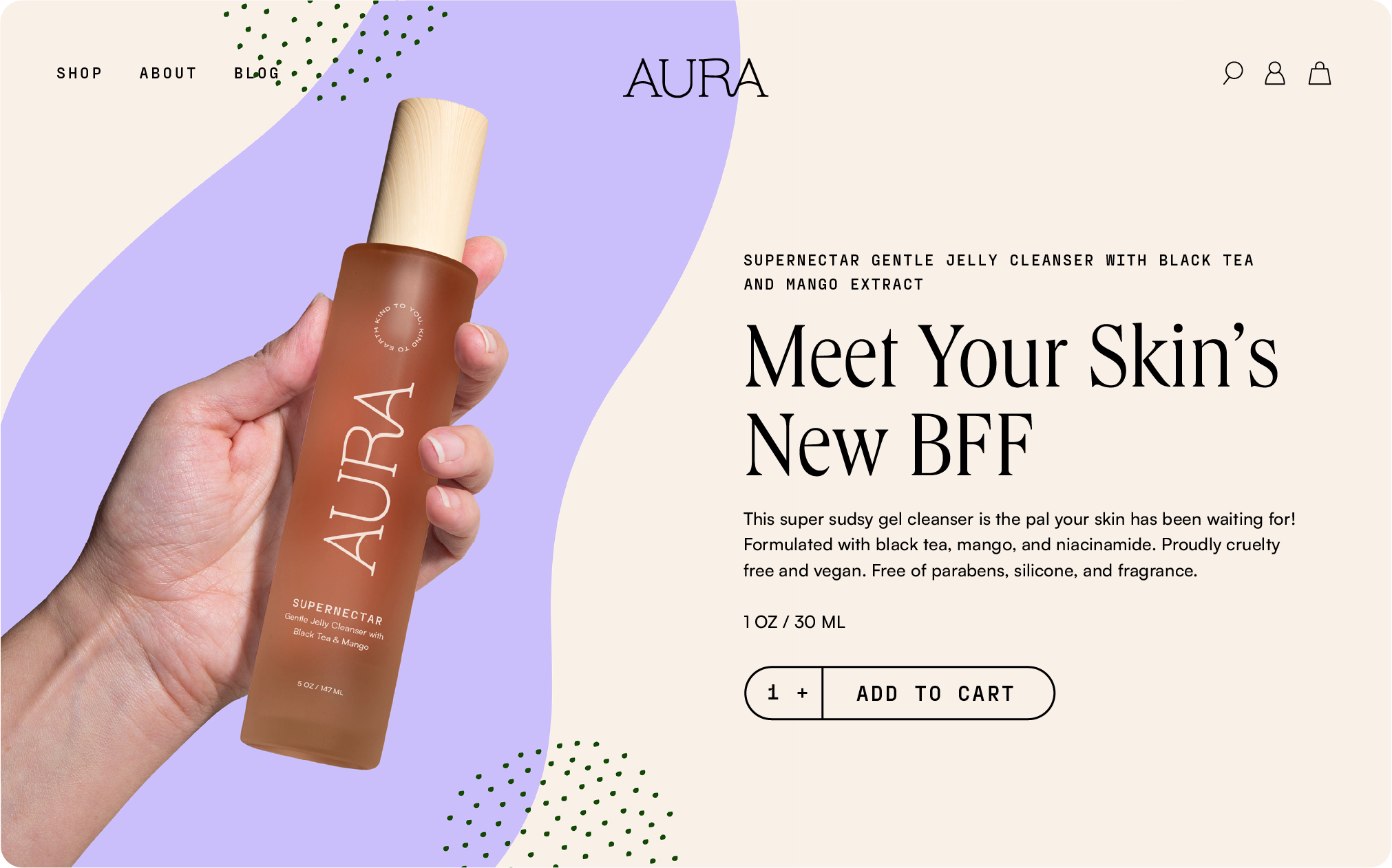
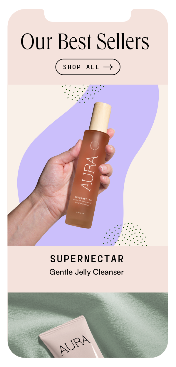
The many curvatures of the logo represent the constant changes your skin (and the earth) goes through over time. The customized type displays fluidity without compromising legibility.
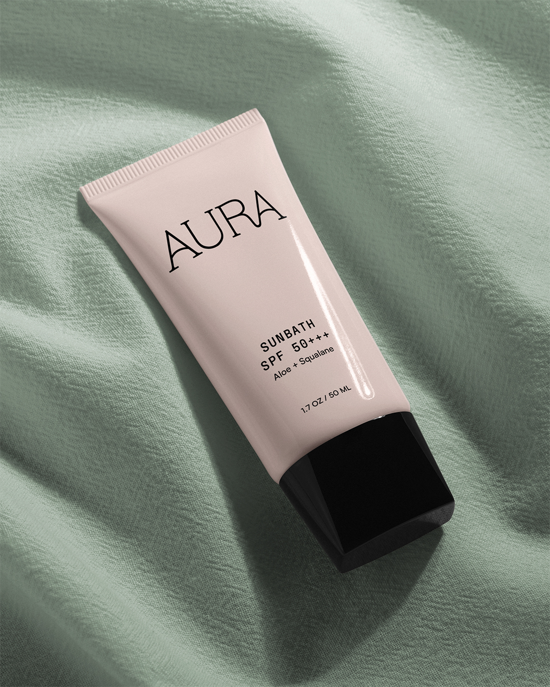
Many skincare brands are gendered by color (black and grey packaging marketed to men and pink and pastels to women). I wanted the look and feel of the brand to be bold, genderneutral, and in touch with nature.

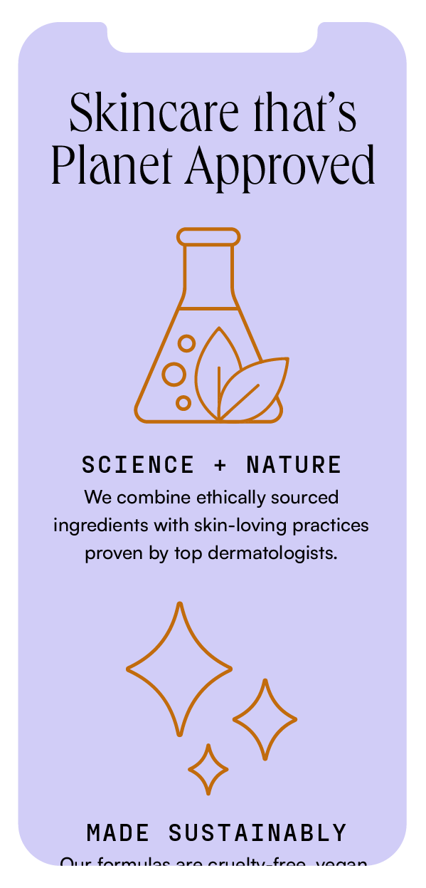
The shape and dots graphic elements help carry the theme of the fluidity. The dots represent the pores of the natural skin’s texture while the abstract shapes mimic different skin types and concerns.